

The best office paint colors support the room’s purpose, lighting, brand style, and cleaning needs. Warm whites, soft grays, light blues, muted greens, and balanced neutral shades can all work well. No color can promise better work or higher output, so businesses should choose colors based on the way each space looks, feels, and functions.
An office color plan should do more than follow a current trend. It should help visitors understand the brand, make work areas feel clear, and allow the maintenance team to handle marks and touch-ups with less trouble. A reception area may need a stronger first impression, while a private office may need a quieter background for screens, furniture, and documents. Lighting also changes color through the day, so every final choice should be tested inside the real office. For help with the wider project, use our commercial painting planning guide.
How Should a Business Choose Office Paint Colors?
A business should begin with the room’s use, not with a color chart. Ask who uses the space, how long they stay there, what furniture will remain, and how often the walls need cleaning. A lobby used by clients has different needs from a storage room or private office. The color should also work with the floor, ceiling, trim, signs, desks, and window light. A useful palette often includes one main neutral, one trim color, and one or two brand accents. This approach creates a steady look without making each room feel the same. Businesses planning office painting in Cleveland should also think about cloudy days, winter light, and the type of LED fixtures already inside the property.
Which Colors Work Well in Focused Work Areas?
Soft neutrals are often a practical choice for rooms where people read, write, meet, or use computer screens. Warm white, light beige, soft gray, muted blue, and calm green can create a clean background without drawing too much attention. This does not mean that one color will improve every person’s focus. People respond to color in different ways, and the room’s light and layout may matter just as much. Very bright colors can become tiring when used across every wall, while a very dark room may need more light to stay useful. The best paint colors for office work are often balanced shades that support the furniture, reduce harsh contrast, and allow signs or displays to remain easy to see.
What Colors Work Well in Reception Areas?
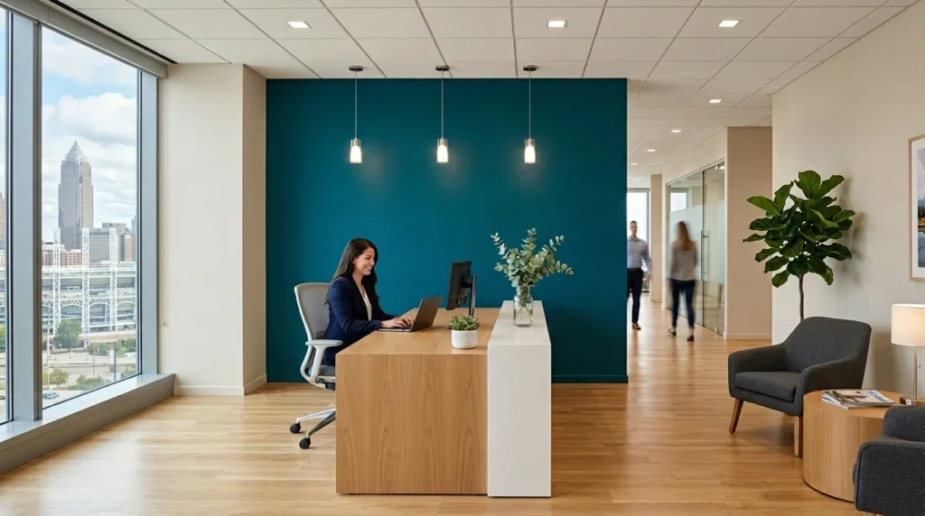
A reception area should feel connected to the business and easy to understand. Visitors should be able to find the desk, doors, signs, and waiting area without visual clutter. Warm neutrals can form a calm base, while a brand color can mark the main desk, logo wall, or feature area. A law office may prefer deep blue, charcoal, or warm gray accents, while a design company may use a stronger color in a smaller space. These choices are about appearance and brand fit, not proven effects on trust or mood. The finish should also handle marks from bags, chairs, and frequent foot traffic. A balanced reception palette can look professional while still being easy to clean and repair.
What Colors Suit Conference Rooms?
Conference rooms should support meetings, screens, video calls, and printed materials. A strong color behind every seat may look busy on camera, while a very bright white may create glare under harsh lights. Soft gray, warm white, muted blue, taupe, or a low-key brand shade can provide a steady background. A darker accent wall may work behind the main screen or company logo when the room has enough light. The final color should be checked from each seat because windows and ceiling lights can change how it looks across the room. Businesses should also test the color during a video call, since cameras may show undertones that are less clear in person.
How Should Open-Plan Offices and Quiet Rooms Differ?
Open-plan offices contain many desks, screens, storage units, signs, and people. A simple wall palette can help keep the space from feeling too busy. Light neutrals often work well across the main walls, while color can be used to mark meeting zones, paths, or shared areas. Quiet rooms and private offices can use slightly deeper shades when the room has enough light. The goal is not to label blue as a focus color or yellow as a creative color. Instead, use color to help people see how each area is meant to be used. A clear but limited palette can also make future touch-ups easier because fewer paint colors need to be stored and matched.
How Does Lighting Change Office Paint Color?
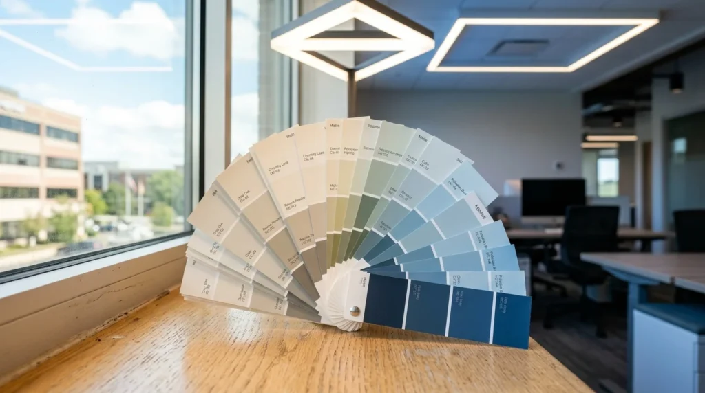
Lighting can make the same paint look warm, cool, bright, dull, green, or gray. Natural light changes from morning to evening, while LED lights may have a warm or cool tone. A color that looks clean near a sunny window may look flat in a hall with no natural light. This is why small paper chips are not enough for a final choice. Light Reflectance Value, or LRV, shows how much light a painted surface reflects. A higher LRV reflects more light, while a lower LRV absorbs more. LRV is useful, but it does not tell the full story because undertones and light sources still affect the final look. Large samples should be tested on more than one wall and checked throughout the workday.
How Can Brand Colors Be Used Without Taking Over the Office?
Brand colors do not need to cover every wall. A strong logo color may work better on one feature wall, behind a reception desk, around a sign, or inside a meeting area. The rest of the office can use quieter shades that support the brand without fighting with it. This makes the bold color easier to maintain and change later. It also gives signs, screens, art, and furniture more room to stand out. The color should be compared with the real logo, not only a digital file, because screens and printed materials may show the shade in different ways. A simple palette guide can record the paint name, finish, room, and approved use for each color.
When Does an Accent Wall Make Sense?
An accent wall works best when it has a clear reason. It may frame a logo, mark the reception desk, support a meeting screen, or help visitors see the main path. An accent wall should not be added only because the room feels plain. First check whether the wall has outlets, vents, doors, signs, or other details that may break up the color. The shade should also work with the main walls and nearby rooms. A strong accent can look useful in a small area but feel heavy across a long hallway. Testing a large sample helps the business see whether the color remains balanced under daytime and evening lighting.
Which Paint Finish Is Easiest to Maintain?
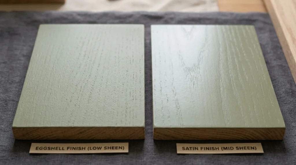
The finish affects how the color looks and how easily the wall can be cleaned. Flat and matte finishes reflect less light and may hide small wall flaws, but some products can mark more easily in busy areas. Eggshell gives a soft sheen and is often used where light cleaning is needed. Satin reflects more light and may be useful in halls, break rooms, reception areas, and other high-contact spaces. Semi-gloss is often used on doors, frames, and trim rather than every office wall. The exact choice should be based on the product, traffic, wall condition, and cleaning plan. Higher sheen may improve cleaning, but it can also make patches and surface flaws easier to see.
Should an Office Use Low-VOC Paint?
Low-VOC paint may be useful in an occupied office, but the label should not be treated as a full indoor-air guarantee. Paint choice should also consider odor, total emissions, durability, cleaning needs, ventilation, and the time before staff return. EPA notes that products marked low-VOC or zero-VOC may still contain or release other chemicals, so VOC content alone does not describe the whole product. The work plan should follow the product label and include suitable fresh air during and after painting. Sensitive rooms may also need longer before they return to use. A lower-emitting coating that does not meet the room’s wear needs may need early repair, so the final choice should balance indoor use with long-term performance.
How Should Office Colors Be Tested?
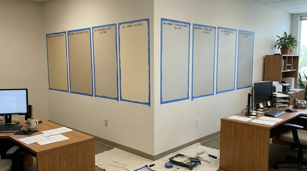
The safest process is to narrow the choices, place large samples in the real rooms, and check them for several days. Samples should be viewed near windows, inside halls, under ceiling lights, and beside the existing floor and furniture. A color may look very different beside cool gray carpet than it does beside warm wood. The business should also check how the shade looks on video calls and behind signs or screens. When several rooms connect, place the samples where both colors can be seen together. Record the final color, product, finish, and room name once the choice is approved. This simple step helps prevent color drift during future touch-ups or work at another company location.

Do Color Choices Affect Office Painting Cost?
Color can affect commercial office painting prices, but it is only one part of the estimate. A strong dark-to-light change may need added primer or finish coats, while a similar color may be simpler to cover. Using many colors can add setup, cutting, labeling, and leftover material. Accent walls may add detail even when they use little paint. The wall condition, room access, furniture, work hours, and number of coats often have a larger effect than the color itself. Businesses should ask the contractor to state which colors and coats are included. For a wider cost breakdown, read our commercial interior painting cost guide.
When Is Professional Office Painting Useful?
Professional office painting is useful when the building must stay open, the walls need repair, the project includes several colors, or the work must follow a set schedule. A site review can help identify stains, damaged drywall, hard-to-reach walls, and areas that need stronger protection. The contractor can also plan the work around meetings, clients, equipment, and daily cleaning. Color support should not rely on broad claims about mood or employee output. It should compare the real lighting, brand materials, furniture, room use, and maintenance needs. Knapp Painting’s office painting service can help Cleveland businesses plan the colors, surface work, protection, and schedule for their workplace.
Frequently Asked Questions
What are the best office paint colors?
The best choice depends on the room, lighting, brand, furniture, and cleaning needs. Warm whites, soft grays, muted blues, greens, and balanced neutral colors are common starting points.
Which colors are best for focused work?
No color can promise better focus. Quiet neutral, blue, or green shades may create a simple background, but lighting, room use, and personal response also matter.
What colors work well in a reception area?
A neutral base with a limited brand accent often works well. The palette should guide visitors toward the main desk, signs, and doors without making the room feel busy.
How does LED lighting affect office colors?
Warm and cool LED lamps can change the way paint undertones appear. Test large samples under the actual lights used during normal business hours.
Is eggshell or satin better for office walls?
Eggshell may suit lower-contact rooms, while satin may be easier to clean in busy areas. The final choice depends on the product and wall condition.
Should every office use low-VOC paint?
Not always. VOC level is only one part of product choice. Durability, emissions, odor, ventilation, cleaning, and return-to-use time should also be reviewed.
Can a company use its logo color on every wall?
It can, but a strong brand color may work better as an accent. A quieter main palette can keep the space balanced and make future touch-ups easier.
Choose Colors That Fit the Real Office
The right office paint colors should fit the room, lighting, brand, and maintenance plan. A good palette stays clear across different spaces and remains practical after the project is finished.
To plan color samples, surface repairs, and a work schedule for your Cleveland office, contact Knapp Painting to request an office painting review.