Earthy colors were previously the long-desired retreat from the cool-colored minimalistic era. Consider sand tones, clay, sage green, and slate blues: they are neutrals we feel at ease with, and although they may be a bit more welcoming than the white-washed rooms, they are also likely to look flat and even muddy. The solution? Use of the best earthy tones for walls with a vibrant festive touch.
“What I call earthy vibrancy is this new generation of grounded color, but with a slight radiance, which prevents it from being one-dimensional”, says Tash Bradley, who is a color expert and the interior design director at Lick. She adds, “They’ve got life in them.”
In this article, insights from the expert designers unravel this new trend of color and share tips on how to use it in your home.
What Is the New Color Trend of Earthy Vibrancy?
About a decade ago, all was dominated by cool millennial grays, as Tash puts it. Then softly into the warmer beiges swung. We have now entered the rich, bracing tones, and all there with that lovely, warm, earthy yellow undertone running through them.
Individuals desire to style their homes in a manner that is individual and revealing, out of which they do not wish to change the design every twelve months, Tash puts it. That is why these more down-to-earth, sun-washed, warm sounds have burst. They immediately turn a house into a place to live in, a soul and a comfort, yet there is also enough energy and color in them to ensure that things remain contemporary and positive.
How To Incorporate Vibrant Earthy Tones in Your House
Consider this as not a design trend but rather a reversion to a more daring use of color that covers a room with warm and rich colors. The earthy tones interior design does not have any real rules, but it is always good to use the tones that complement the colors that you are automatically attracted to.
Ornamentation with Pink to Add Coziness
The pink wallpaper used in the dining room is very vibrant, yet at the same time, it looks normal in the traditional decorations. The earthly tones in the paper provide the illusion that the paper has long been in the room rather than newly placed, according to the interior designer Lauren Robbins.
Earth tones are used to bring a space down to make it feel cozy and rich, Lauren further adds. I love these shades as they are modern and classic.
Be inspired by this warm earthy tones interior design and think about the idea of being able to decorate using pink as an accent and still leave the room looking comfortable and classic.
Saturate Walls With an Abundant Hue of Olive
The interior designer Roger Higgins describes it as having a trim that is painted with Relentless Olive by Sherwin-Williams and the walls covered with a mossy green cloth.
Although the colour scheme of green is a rather neutral one, warm and rich olive is rather lively, as it is. That is my favorite earthly green color, Roger goes on. Swathing a room in it gives the room a cozy, comfortable, enveloping effect.
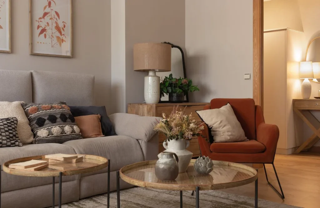
Get Out Of Traditional Neutrals With Terracotta
In case you have been used to using neutrals and you are not ready to push the boundaries to the extreme earthy paint colors for home, then terracotta decor makes it an excellent solution to fill the gaps. In speaking about the design of this dining room, Roger Higgins says, ‘This client was on the lookout for neutrals and avoided bright color.’
I was going to be breaking up the neutrals in the rest of the house with this terracotta color, he says. The deep colour – particularly in combination with beautiful millwork and antique furnishing – was giving a richness and homeiness.
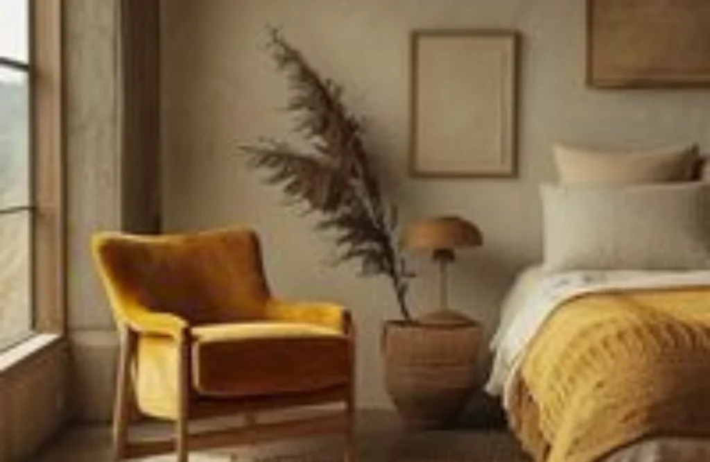
Add Moodiness With Ochre
Other colors that can fit the trend of bringing the earthly vibrancy are ochre, which is a classic and classy variation of decoration using yellow. In this work, the interior designer Victoria Tanforan decided to use a deep ochre on the walls. She claims that it was chosen cautiously in order to respect the historic environment of the house without being too serious or too childish.
Colours like ochre also give rooms a lot of richness and would be a great alternative to the pale yellows, which would look washed out in some instances. According to Victoria, they are especially effective in historic houses since they bring out as much character in them.
Get in touch with Knapp Painting LLC now to turn your dull colored rooms in Ohio into modern yet soothing places with the best earthy tones for walls.
FAQs
It has luscious, invigorating, down-to-earth hues with ingenious yellow lines for life and soul. These colours are not cool grays and beige; unlike flat neutrals, they are eternal, intimate, and dense.
Paint walls with deep olive or ochre to make a warm wrapping. Try out pink wallpapers, deep red on furniture, or mixes, such as olive green and fresh blue, to surprise in a modern way.
These relaxing earthy wall colors are made to form habitable, expressive rooms which are beautiful and balanced in the real modern sense.